Internal Platform (NDA)

NDA Work Project

Retail

B2B

Desktop/Mobile Web

Internal Platform (NDA)

NDA Work Project

Retail

B2B

Desktop/Mobile Web

Internal Platform (NDA)

NDA Work Project

Retail

B2B

Desktop/Mobile Web

Due to NDA constraints, many images and processes were omitted and substituted.
Here are some brief notes about the work I did during this time-

Due to NDA constraints, many images and processes were omitted and substituted.
Here are some brief notes about the work I did during this time-

Due to NDA constraints, many images and processes were omitted and substituted.
Here are some brief notes about the work I did during this time-

I was a sole UI/UX designer within the product team. During this project, I focused on redesigning an internal platform for all employees, clients and associates, serving as a central hub for managing transactional data. The redesigned interface not only enables users to better trust and gain control over the platform, but also simplifies their workflows — a vital step for rapidly growing enterprise.

MY ROLE

Sole UI/UX designer : User Research, User Interview, Hi-fi Mockups, Prototyping, User Testing

COLLABORATED WITH

Product, engineering, business and operations teams.

DURATION

Dec 2023 - Mar 2024

How It Started

Problem Space

A feedback session with internal stakeholders revealed several issues within the platform.

Despite company's growth, the platform was not originally designed to scale effectively, leading to scalability challenges, data inaccuracies, and usability concerns.

Despite company's growth, the platform was not originally designed to scale effectively, leading to scalability challenges, data inaccuracies, and usability concerns.

Despite company's growth, the platform was not originally designed to scale effectively, leading to scalability challenges, data inaccuracies, and usability concerns.

Objectives

Business Goals: Enhance the platform's scalability and reliability to support the company's rapid growth and diversifying service array.

User Goals: Enhance user experience to boost efficiency and minimize human errors.

What I Achieved

After my redesign, the platform now aligns more closely with a broader concept concept of operations that offers:

  1. Improved management of diverse data streams.

  1. Improved management of diverse data streams.

  1. Improved management of diverse data streams.

  1. A user interface enhanced for clarity.

  1. A user interface enhanced for clarity.

  1. A user interface enhanced for clarity.

  1. Successfully built solutions that enhance user trust and autonomy, streamline comprehension, and reduce mistakes.

  1. Successfully built solutions that enhance user trust and autonomy, streamline comprehension, and reduce mistakes.

  1. Successfully built solutions that enhance user trust and autonomy, streamline comprehension, and reduce mistakes.

The Challenges

Complex User Base

Redesigning specific features and pages had to cater to a complex user base without unsettling established routines or requirements. The goal was to maintain clarity and accessibility without imposing new learning demands on current users.

Complex User Base

Redesigning specific features and pages had to cater to a complex user base without unsettling established routines or requirements. The goal was to maintain clarity and accessibility without imposing new learning demands on current users.

Complex User Base

Redesigning specific features and pages had to cater to a complex user base without unsettling established routines or requirements. The goal was to maintain clarity and accessibility without imposing new learning demands on current users.

Limited Time/Budget:

Redesigning specific features and pages had to cater to a complex user base without unsettling established routines or requirements. The goal was to maintain clarity and accessibility without imposing new learning demands on current users.

Limited Time/Budget:

Redesigning specific features and pages had to cater to a complex user base without unsettling established routines or requirements. The goal was to maintain clarity and accessibility without imposing new learning demands on current users.

Limited Time/Budget:

Redesigning specific features and pages had to cater to a complex user base without unsettling established routines or requirements. The goal was to maintain clarity and accessibility without imposing new learning demands on current users.

Steep Learning Curve:

Joining team with existing products while no solid documentation or differences between production and design files were overwhelming to me. I found myself at the first feedback meeting without prior exposure to the platform. The terminologies, features, and their purposes were alien concepts to me. A significant amount of time was spent to getting the gist of all features and use cases.

Start From Zero

Opened the Gateway Through Conversations

I started by having conversations with stakeholders, where I learned about the use cases of current features, workflows for targeting user groups, terminologies, the diversity of data, and how data moves within the system — key factors in understanding what information was vital for users.

Gaining Insights Through Empathy

I stepped into the shoes of the users who had experienced issues with the platform after stakeholder interviews. This approach allowed me to further emphasize their pains and needs.

Their frustration centered around : trust in the information provided, having to interpret or guess different meanings or actions behind different elements.

Breaking Down the Problems

Segmenting larger issues into smaller ones allowed me to identify and address two fundamental problems:

1. The misrepresentation of information.

1. The misrepresentation of

information.

1. The misrepresentation of information.

2. The lack of intuitive navigation.

2. The lack of intuitive navigation.

2. The lack of intuitive navigation.

To address these, how might we…

increase user's trust in what they see?

increase user's trust in what they see?

increase user's trust in what they see?

make navigation more intuitive, reducing feelings of being overwhelmed?

make navigation more intuitive, reducing feelings of being overwhelmed?

make navigation more intuitive, reducing feelings of being overwhelmed?

create a streamlined process to minimize extra steps needed by the users?

create a streamlined process to minimize extra steps needed by the users?

create a streamlined process to minimize extra steps needed by the users?

Exploration

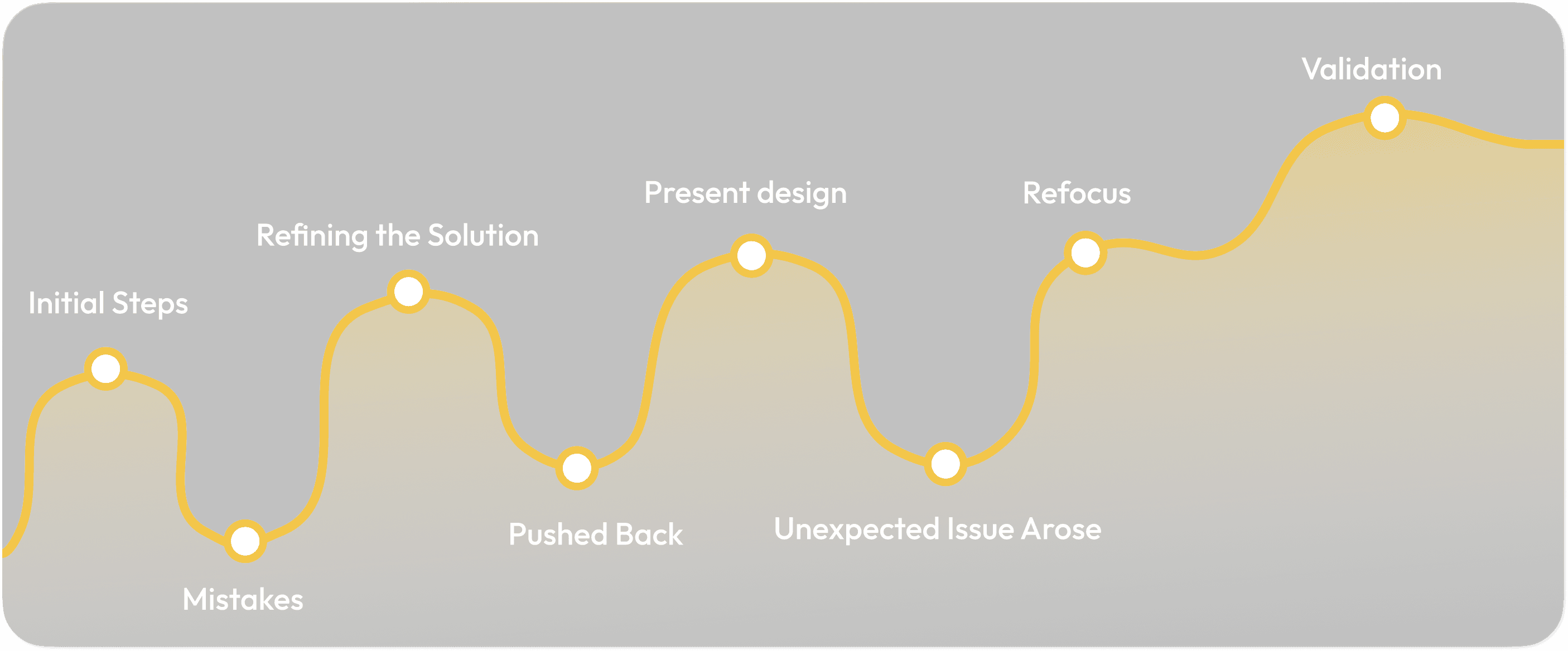
My adventure in improving the platform was a rollercoaster ride filled with ups and downs.

From Initial Steps To Presenting Design

At the beginning, I was a bit too eager. I had ideas but faced pushbacks several times. I did not dig deeper. This early mistake was a wake-up call: always question and clarify before acting. It also became clear that such changes could disrupt user habits and require additional training, highlighting the important balance between introducing new features and maintaining user comfort.

Unexpected Issue Arose

Presenting design changes to the stakeholders was crucial. As discussion going, a newly identified issue popped out and required a reevaluation.

It was a stark reminder that user needs and technical capabilities are always evolving, and staying adaptable is key.

Unexpected Issue Arose

Presenting design changes to the stakeholders was crucial. As discussion going, a newly identified issue popped out and required a reevaluation.

It was a stark reminder that user needs and technical capabilities are always evolving, and staying adaptable is key.

Unexpected Issue Arose

Presenting design changes to the stakeholders was crucial. As discussion going, a newly identified issue popped out and required a reevaluation.

It was a stark reminder that user needs and technical capabilities are always evolving, and staying adaptable is key.

Focused Refinement

To tackle the new issue, I broke it down methodically and discuss my initial idea with the engineer to discuss technical feasibility. The resulting design, with a focus on mobile experience, aimed to uphold information trustworthiness.

Focused Refinement

To tackle the new issue, I broke it down methodically and discuss my initial idea with the engineer to discuss technical feasibility. The resulting design, with a focus on mobile experience, aimed to uphold information trustworthiness.

Focused Refinement

To tackle the new issue, I broke it down methodically and discuss my initial idea with the engineer to discuss technical feasibility. The resulting design, with a focus on mobile experience, aimed to uphold information trustworthiness.

Testing and Feedback

To validate my design decisions of certain flow, ensuring that they met user needs and enhanced their experience with the platform, I conducted user testing with internal stakeholders by having them walk through specific tasks and scenarios using my prototype.

The main goals were: The usability of the redesigned layout, the functionality of key pages, and the effectiveness of interface elements.

I cannot share the detail publicly, but as a bonus, here are some findings:

Varied Levels of Comprehension:

Users successfully completed the tasks assigned, but not all of them had the same level of understanding or certainty of revised elements.

Varied Levels of Comprehension:

Users successfully completed the tasks assigned, but not all of them had the same level of understanding or certainty of revised elements.

Varied Levels of Comprehension:

Users successfully completed the tasks assigned, but not all of them had the same level of understanding or certainty of revised elements.

Limited Feedback Variety:

With limited users, the diversity of feedback and perspectives I collected was limited. I might be likely to miss out on identifying a broader range of user needs and preferences.

Limited Feedback Variety:

With limited users, the diversity of feedback and perspectives I collected was limited. I might be likely to miss out on identifying a broader range of user needs and preferences.

Limited Feedback Variety:

With limited users, the diversity of feedback and perspectives I collected was limited. I might be likely to miss out on identifying a broader range of user needs and preferences.

Takeaways

Embrace Uncertainty

Not everything was clear from the start. Being comfortable with uncertainty and change can lead to discovery and innovation.

Collaboration is always key to drive project forward

I don't think I would be able to reach what I achieved without others' collaboration. There's always something new every time I talk to users and stakeholders.

Connected Nature of Design and Business Strategy.

What may seam like a purely design challenge is often intertwined with broader business strategies; no issue is purely a design problem; all issues have underlying business implications.

I am unable to share specific details publicly due to NDA restrictions. However, I welcome the opportunity to discuss my experience further. Please reach out on my Linkedin or email me for more details.

I am unable to share specific details publicly due to NDA restrictions. However, I welcome the opportunity to discuss my experience further. Please reach out on my Linkedin or email me for more details.

I am unable to share specific details publicly due to NDA restrictions. However, I welcome the opportunity to discuss my experience further. Please reach out on my Linkedin or email me for more details.

Thanks for dropping by!

Thanks for dropping by!

Get in touch!

Get in touch!

Get in touch!

Copyright © 2024  All rights reserved